Single Component CSS Grid Frontend Mentor Challenge: Full-step Tutorial

I am a programmer with a great interest in sharing web programming nuggets with the tech community. My particular areas of interest include Ruby, Ruby on Rails, Javascript, and ReactJs.
Introduction
After watching Brad Traversy's CSS Grid tutorial, I sought a worthwhile development challenge on the question. In light of that, I found one on Frontend Mentor. I found it quite simple and I describe the development process briefly.
Challenge Instructions
Producing an optimal layout for different screen sizes as rendered in this design from the Frontend mentor website. In addition, the challenge requires applying any desdired hover state change on the Sign Up button for the desktop view.
Tools and Resources
Frontend mentor resources: Here, I found the vital project style guide (that includes color codes, design widths, font size, and font family) and the README template (with extra instructions and ofcourse the template documentation).
Google: Searching online resources to resolve any pitfalls I run into.
VS Code Editor: Shifted to VS Code after a month's stint of using the Sublime Text Code editor. I have frankly found VS Code more versatile than the latter code editor. In particular, VS Code has a convenient inbuilt command line for running git bash commands. Besides, the inbuilt Emmet toolkit has significantly increased my productivity especially when penning html markdown.
Chrome or Mozilla: Any of these browsers will do to visualize the layout grids in the developer tools section. Such visualization is critical as explained in Traversy's tutorial, especially in specifying the column and row spans in the stylesheet.
My Solution Screenshots and hosted site URL
I took these screenshots using Mozilla Firefox's screenshot tool, available in its context-sensitive menu.
Desktop view screenshot
 The desktop view screenshot is too large. Click here to view it on my GitHub profile.
Mid screen view screenshot
Mobile view screenshot
 On its part, the mobile view screenshot is equally size incompatible. Click here to view it on my GitHub profile.
Static site URL: Click here to view the complete project as a website.
My Development Process
Web Technologies and Principles Employed
- Non-semantic HTML5 markup.
- CSS3 Custom properties.
- CSS Grid.
- Mobile-first responsive design (using media query).
Step 1: Project HTML Skeleton and Class Naming (Grid Container and Grid Items)
The skeleton consists of a grid container that's a div element having "price-card" as its custom class name. In this container, I created three grid items/elements, all div elements with appropriate names, that is, "card--bg-white", "card--bg-darkcyan", and "card--bg-lightcyan"
As seen in the previous paragraph, the grid items class names assume a uniform naming convention that includes the object in question (in this case the cards) and their background colors. Developer circles call this CSS class selector name convention the block, element, modifier (BEM). BEM's primary purpose is improving code maintainability, which means greater developer productivity. I read a concise BEM article over at freeCodeCamp.
See below for the HTML skeleton code snippet:
<!DOCTYPE html>
<html lang="en">
<head>
  <meta charset="UTF-8">
  <meta http-equiv="X-UA-Compatible" content="IE=edge">
  <meta name="viewport" content="width=device-width, initial-scale=1.0">
  <title>Single Price Grid Component Project</title>
</head>
<body>

  <div class="price-card">
    <div class="card--bg-white">
    </div>

    <div class="card--bg-darkcyan">
    </div>

    <div class="card--bg-lightcyan">
    </div>
  </div>

</body>
</html>
Step 2: Populating "card--bg-white" CSS grid item with code
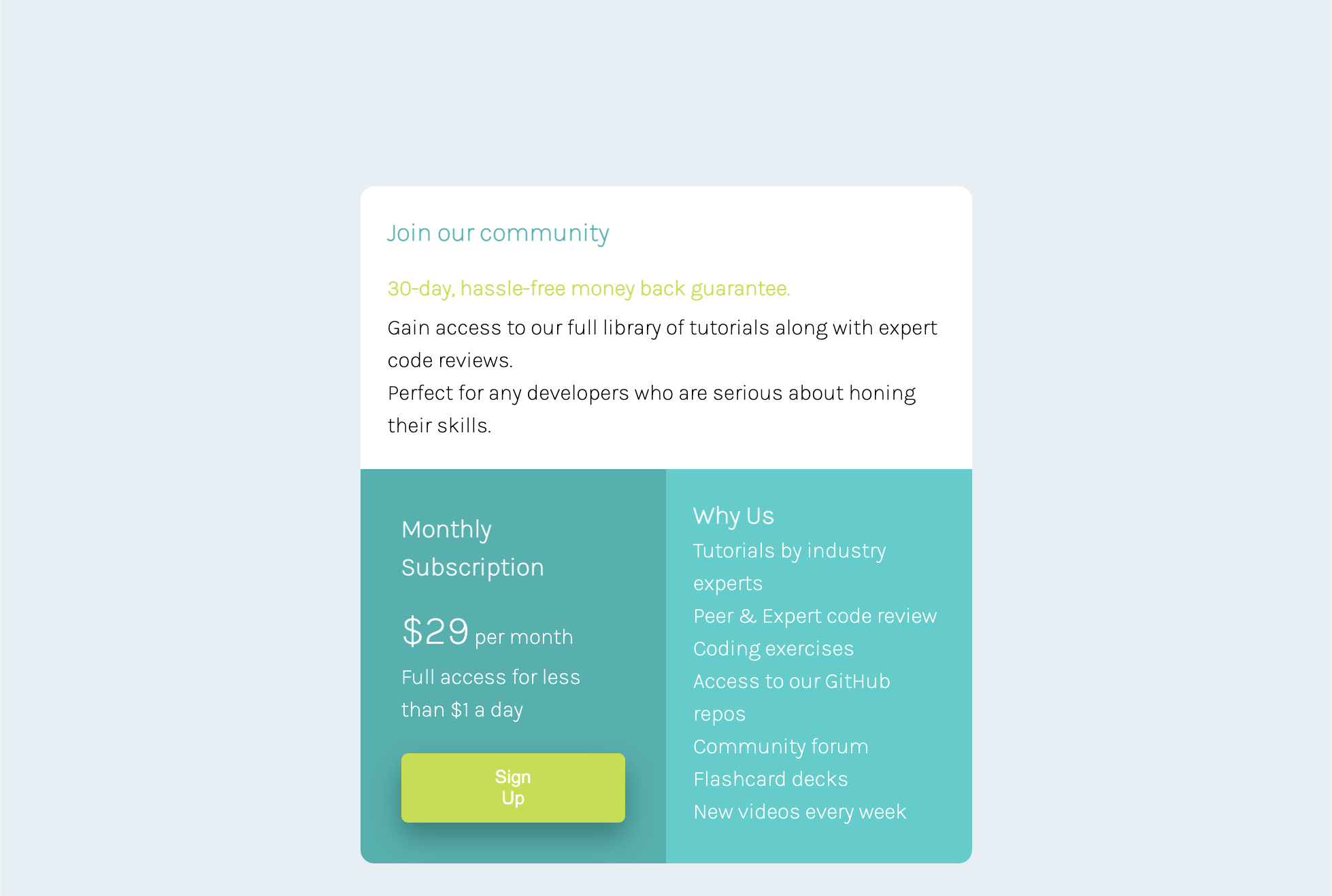
The design mockup portrays a grid item where the first two text lines have special styling. Therefore, I chose a heading 3 for the headliner, then used a paragraph with a class name "card_title" to style the second line.
The remaining text is added within a paragraph element.
Below is the code snippet for this grid item:
<div class="card--bg-white">
      <h3>Join our community</h3>
      <p class="card__title">30-day, hassle-free money back guarantee.</p>
      <p>Gain access to our full library of tutorials along with expert code reviews. <br> Perfect for any developers who are       serious about honing their skills.</p>
</div>
Step 3: Coding the "card--bg-darkcyan" CSS grid element
In this grid item, the headliner was equally set using a heading 3. On its part, the text was wrapped within paragraph elements, with a line break separating the two text parts. An span inline element wrapped the monthly charge amount for styling it with a larger font-size.
The sign up button was wrapped within a div element and style added to center the button in the container thanks to this JavaTPoint resource. Also, I added an anchor element to make sign up a link.
The code snippet below demos these html markdown choices:
<div class="card--bg-darkcyan">
      <h3>Monthly Subscription</h3>
      <p><span>$29</span> per month <br> Full access for less than $1 a day</p>
      <div style="text-align: center;">
      <button class="signup_button"><a href="#signup">Sign Up</a></button>
      </div>
</div>
Step 4: Adding HTML markdown to "card--bg-lightcyan" CSS grid item
I used heading 3 as the headliner for the main text line. I then wrapped the rest of the text within a paragraph element having requisite break elements within it.
Below is the code snippet:
<div class="card--bg-lightcyan">
      <h3>Why Us</h3>
      <p>
        Tutorials by industry experts <br>
        Peer & Expert code review <br>
        Coding exercises <br>
        Access to our GitHub repos <br>
        Community forum <br>
        Flashcard decks <br>
        New videos every week
      </p>
</div>
Step 5: Creating the Stylesheet and Linking to HTML File
With the HTML markdown done, I created a stylesheet file "style.css" on the git bash command line. Next, I linked the stylesheet to the html file using a link element in the head section, as in the code snippet below:
<link rel="stylesheet" href="style.css">
Step 6: Referencing the Challenge's Style Guide
At this juncture, I referred to the style guide in the challenge document folder for the appropriate CSS property values to apply in the stylesheet. In particular, these specifications include:
- Layout widths: Mobile (375px) AND Desktop (1440px).
- Primary colors: Cyan: hsl(179, 62%, 43%) AND Bright Yellow: hsl(71, 73%, 54%)
- Neutral colors: Light Gray: hsl(204, 43%, 93%) AND Grayish Blue: hsl(218, 22%, 67%)
- Typography: Font-size (16px) AND font-family (Karla/Special Elite)
Step 7: Importing Specified Font and Applying Universal/Global Styles
I first imported the required font from Google fonts into the stylesheet using the code snippet below:
@import url("https://fonts.googleapis.com/css2?family=Special+Elite&display=swap");
Next, I used the universal selector (the asterisk symbol) to apply relevant values to the page's CSS box model. In addition, I used the body selector to apply global properties (that can be overridden) to all elements within it. Of relevance in the body properties was setting the specified background color, font-size, and font-family. See the code snippet below:
* {
  box-sizing: border-box;
  margin: 0;
  padding: 0;
}

body {
  background: hsl(204, 43%, 93%);
  font-family: 'Special Elite', cursive, sans-serif;
  font-size: 16px;
  line-height: 1.5;
}
Step 8: Styling the CSS Grid Container
Here, set the max-width specification (1440px). Most critical, I penned the mandatory display grid property and the accompanying property to declare the number of columns (grid-template-columns.) The margin and padding were set suitably. Finally, I set the width to 50% to fit the grid at the page's center rather than occupying the entire width.
See code snippet below:
.price-card {
  max-width: 1440px;
  display: grid;
  grid-template-columns: repeat(2, 1fr);
  margin: 200px auto;
  padding: 20px;
  width: 50%;
  /* border-radius: 20px 20px 20px 20px; */
}
Step 9: Styling the Three CSS Grid Items
For all three Grid items, I specified the border-radius property to render the smooth item edges, specified the background colors as spelt out in the style guide, and specified the appropriate grid-column and grid-row properties. Other property values such as padding, text color and margins were added as desired.
The code below reflects these choices:
.card--bg-white {
  background-color: white;
  grid-column: 1 / 3;
  padding: 20px;
  border-radius: 10px 10px 0px 0px;
}

.card--bg-darkcyan {
  grid-column: 1;
  grid-row: 2;
  padding: 30px;
  background-color: hsl(179, 62%, 43%);
  color: white;
  border-radius: 0 0 0 10px;
}

.card--bg-lightcyan {
  grid-column: 2;
  grid-row: 2;
  padding: 20px;
  color: white;
  background-color: hsl(179, 62%, 50%);
  border-radius: 0 0 10px 0;
}
Step 10: Styling Elements within the "card--bg-white" Grid Item
Following this, I now modified specific elements' styles including h3 and the p element with class "card__title."
Refer to the code snippet below:
.card--bg-white h3 {
  color: hsl(179, 62%, 43%);
  margin-bottom: 15px;
}

.card--bg-white p.card__title {
  color: hsl(71, 73%, 54%);
  font-weight: bold;
  margin-bottom: 5px;
}
Step 11: Styling "card--bg-darkcyan" Grid Item's Elements
Here, I styled the various elements including h3, p, p(span), the "signup_button" class, the anchor element, and applied a hover state to the sign up button.
Refer to the code snippet below:
.card--bg-darkcyan h3 {
  margin-bottom: 10px;
}

.card--bg-darkcyan p {
  margin-bottom: 10px;
}

.card--bg-darkcyan p>span {
  font-size: 30px;
}

.signup_button {
  margin-top: 10px;
  background-color: hsl(71, 73%, 54%);
  padding: 10px 60px;
  border: none;
  border-radius: 5px;
  box-shadow: 0px 10px 20px 0px rgba(0, 0, 0, 0.3);
  width: 100%;
}

.signup_button a {
  text-decoration: none;
  color: white;
}

.signup_button:hover {
  background-color: hsl(71, 73%, 75%);
}
Step 12: The Inevitable Media Query
Having styled the grid component to a beautiful stature, I proceeded to code in a media query to ensure that the grid layout is responsive for differently sized viewports as specified in the design document.
A standard max-width of 768px was specified to switch the grid layout flow to single column for smaller mobile screens. Therefore, the grid container has its max-width, grid-template-columns, and width properties altered.
In the same light, I altered the grid-row and grid-columns of two grid items.
Here is the media query code:
@media (max-width: 768px) {
  .price-card {
    grid-template-columns: 1fr;
    width: 75%;
    margin: auto;
  }

  /* Code needed here to disable hover effect for small screens. */

  .card--bg-white {
    grid-column: 1;
  }

  .card--bg-darkcyan {
    grid-column: 1;
    grid-row: 2;
    border-radius: 0 0 0 0;
  }

  .card--bg-lightcyan {
    grid-column: 1;
    grid-row: 3;
    border-radius: 0 0 10px 10px;
  }
}
As you will notice in the code snippet above, I was not able to disable the hover state for smaller screens, while keeping it enabled for desktop screens as the challenge specifications required.
Please find the complete html file here and the CSS one here.
Continued Development
Today was my first encounter with the BEM CSS class naming convention. BEM convention is an area I hope to polish in future web projects.
Additionally, I need to familiarize with semantic HTML elements rather than relying on non-semantic elements since the former improves search engine optimization (SEO).
Edit:
After posting the complete project on Frontend Mentor, one Raj Prasad suggested a useful resource on semantic HTML tags.
In addition, he suggested a font change to match the specified format, which improved the UX dramatically.
Useful Resource(s)
The resources I include here are already linked within the document above. However, I believe they require a special shout out in their own section :)
- Brad Travery's CSS Grid Tutorial: I have not found a more refreshing crash course on CSS Grid. From it, I learned about the BEM class naming convention, and understood how to use the browser's grid layout visualization in styling grid items.
- Mozilla Developer Network CSS Grid Docs: Every web developer has come across this priceless web dev documentation. While working through this challenge, I referred to it several times on various CSS Grid concepts to make them crystal clear.
Author
Let's connect:
- Frontend Mentor: Mutuma-Gitonga
- Twitter: @devgitonga
- Github: Mutuma-Gitonga
Acknowledgements
I am indebted to tech Twitter and Brad Traversy for introducing me to this skill-sharpening Frontend Mentor website and inspiring me to take up the challenge.


